本文介绍了css3实现画半圆弧线的示例代码,分享给大家,具体如下:
css代码
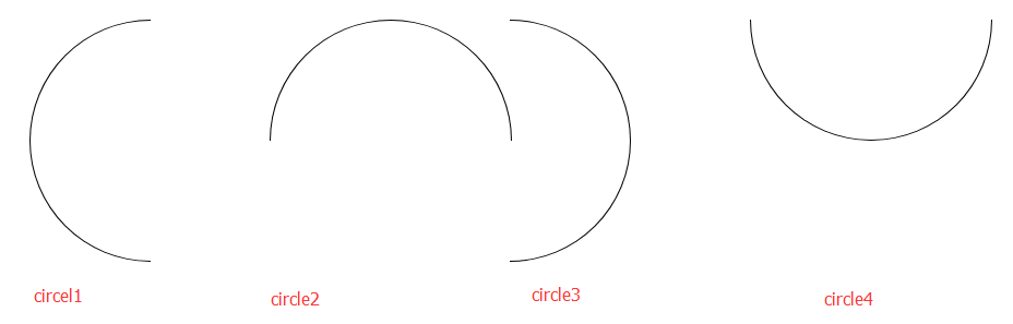
.circle1 {
    width: 100px;
    height: 200px;
    border: 1px solid black;
    border-radius: 100% 0 0 100%/50%;
    border-right: none;
}
.circle2 {
    width: 200px;
    height: 100px;
    border: 1px solid black;
    border-radius: 50% 50% 0 0/100% 100% 0 0;
    border-bottom: none;
}
.circle3 {
    width: 100px;
    height: 200px;
    border: 1px solid black;
    border-radius: 0 100% 100% 0/50%;
    border-left: none;
}
.circle4 {
    width: 200px;
    height: 100px;
    border: 1px solid black;
    border-radius: 0 0 50% 50%/0 0 100% 100% ;
    border-top: none;
}
html代码
<ul>
    <li><div class="circle1"></div></li>
    <li><div class="circle2"></div></li>
    <li><div class="circle3"></div></li>
    <li><div class="circle4"></div></li>
</ul>
效果如下:
以上就是本文的全部内容,希望对大家的学习有所帮助,也希望大家多多支持。
【网站声明】本站除付费源码经过测试外,其他素材未做测试,不保证完整性,网站上部分源码仅限学习交流,请勿用于商业用途。如损害你的权益请联系客服QQ:2655101040 给予处理,谢谢支持。